Beyond traditional heatmaps
Most heatmap tools show you colored blobs on a screenshot. You stare at the colors, guess what they mean, and hope you're right. Onboardics shows you element-level click data ranked by frequency — and then AI tells you what's broken and how to fix it.
How it works
Install once, track everything
The Onboardics snippet captures every click on every element across every page. No per-page configuration, no screenshot setup, no session recording storage costs.
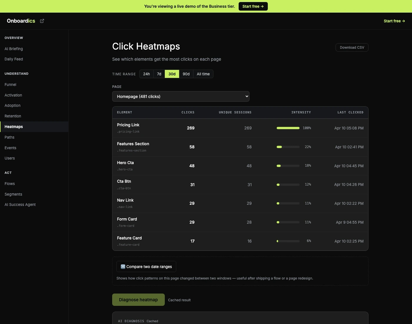
Browse by page
Select any page from the dropdown. See the top clicked elements ranked by frequency with intensity bars. Filter by time range (24h, 7d, 30d, all time). Toggle between top 10 and all elements.
AI diagnoses patterns
Click "Diagnose with AI" and get findings across 5 categories: rage clicks (frustration signals), wrong-element gravitation (users clicking non-interactive elements), dead zones (important areas getting zero clicks), CTA underperformance, and feature discovery gaps.
What AI detects
- Rage clicks — users clicking the same element rapidly out of frustration (broken buttons, unresponsive UI)
- Wrong-element gravitation — users clicking non-interactive elements they expect to be clickable (images that look like buttons, text that looks like links)
- Dead zones — important page areas getting zero engagement (buried CTAs, invisible features)
- CTA underperformance — call-to-action buttons getting fewer clicks than expected based on page traffic
- Feature discovery gaps — product features that users never find or interact with
- Each finding includes severity, explanation, and the recommended fix. When the fix is overlay-able (Deploy and above), a "Create flow →" link auto-generates the in-app fix. When it's structural — the CTA leads to a broken destination, the dead zone needs a layout change, the rage-clicked element is fundamentally wrong — the recommendation comes back as a code spec instead.
Before/after comparison
Shipped a flow? Redesigned a page? Pick two date ranges and see how click patterns shifted, element by element. The diff table highlights which CTAs got more traffic (green) and which lost it (red), sorted by absolute change. Pairs with the Flow ROI card on the Flows page — click patterns explain the why behind conversion changes.
Defaults to “last 7 days vs. the 7 before that” — the most common diff anyone wants to see — but either range is editable to any window you want.
Pricing
Click heatmaps with AI diagnosis and before/after comparison are available on Diagnose ($149/mo) and above.